
We should always be aiming for great user experiences. A great user experience now demands that sites be accessible – if not delightful – across devices. In order to appeal to this demand, UX design must defer to technical factors and must work within those limitations – or possibilities. What technology has come up with to address this multi-device need are known as breakpoints – the points at which the system performs a media query and rearranges the responsive grid to better fit the dimensions of a specific screen-size. But the range of screen-sizes appearing across the market blur our understanding of where these break-points should occur.
The days of mobiles, tablets, laptops and desktops as distinct entities are over and so, therefore, should be the days of breakpoints as a solution to responsive design.
In practice, however, breakpoints remain the solution du jour. Websites are sticking to media queries and responsive grids, ticking off the responsive entry on their to-do lists. One of the problems with this approach is that there are no magical breakpoints that work for all devices with all their variations of screen sizes.
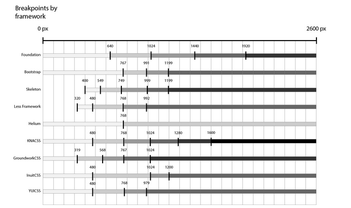
In the diagram above, I have documented the built-in breakpoints for some of the world’s most popular front-end frameworks. As you can see, not one of them agrees on the same set. This goes to show that, even within the practice of using breakpoints, there is little to no agreement on how exactly to employ them.
Moreover, these frameworks and other practicers of the breakpoint solution hinder the ultimate goal of providing good user experience across devices. As Ian Carrico explains in his blogpost You Don’t Need Bootstrap: “First off, Bootstrap does not give you a truly responsive design. It supports the idea that there should be 4 breakpoints based off of the idea that we are building websites to phones, tablets and desktops.
This is contrary to the idea of designing and building a site based upon content, and ensuring the site is usable, no matter the device that views it.”
A truly responsive design is not based on breakpoints and layouts; it is helping users achieve their goals no matter the device. It is content that should come first, not screen-size; and what should follow content is context. This context goes beyond device classifications and screen-sizes because it does not appropriate technology to its own limitations, but rather, it allows technology to flourish within its possibilities.

Say that you’re using a 3G mobile device to find the address of a restaurant and navigate to the restaurant’s site which has a beautiful introductory video on its landing page; this is unfortunate, however, given the context. Your bandwidth is probably lower than what it would be on your personal or business wifi so loading something like a high definition video is going to hinder the achievement of your goal. In this scenario, the context of the user should ask that the content adapt to the situation. Performance – as the efficient and effective delivery of contextual content – is the key to building great cross-device experiences. Matt Gibson from Cyber-Duck found an alternative to breakpoints and media queries by, as he says, “putting the speed of our website at the heart of all design and technology decisions”. Where we currently make screen-size related decisions, we should actually be making performance related decisions and make sure the technology really works no matter the device.
As the proliferation of devices and screen-sizes continues, we should look at performance as the best indicator of context within a contextual approach to responsive design. Breakpoints, however, should not be completely forgotten, and screen size should not be completely eradicated from our understanding of how to provide great experiences.
I believe 2 screen-sizes remain relevant – the very small and the very large – the smart watch and the smart tv. On these tiny and on these gigantic screens the restriction and the expanse become a context within itself and size does matter.
Author: Jessica Dilworth